H&R Block
companion client monitor redesign
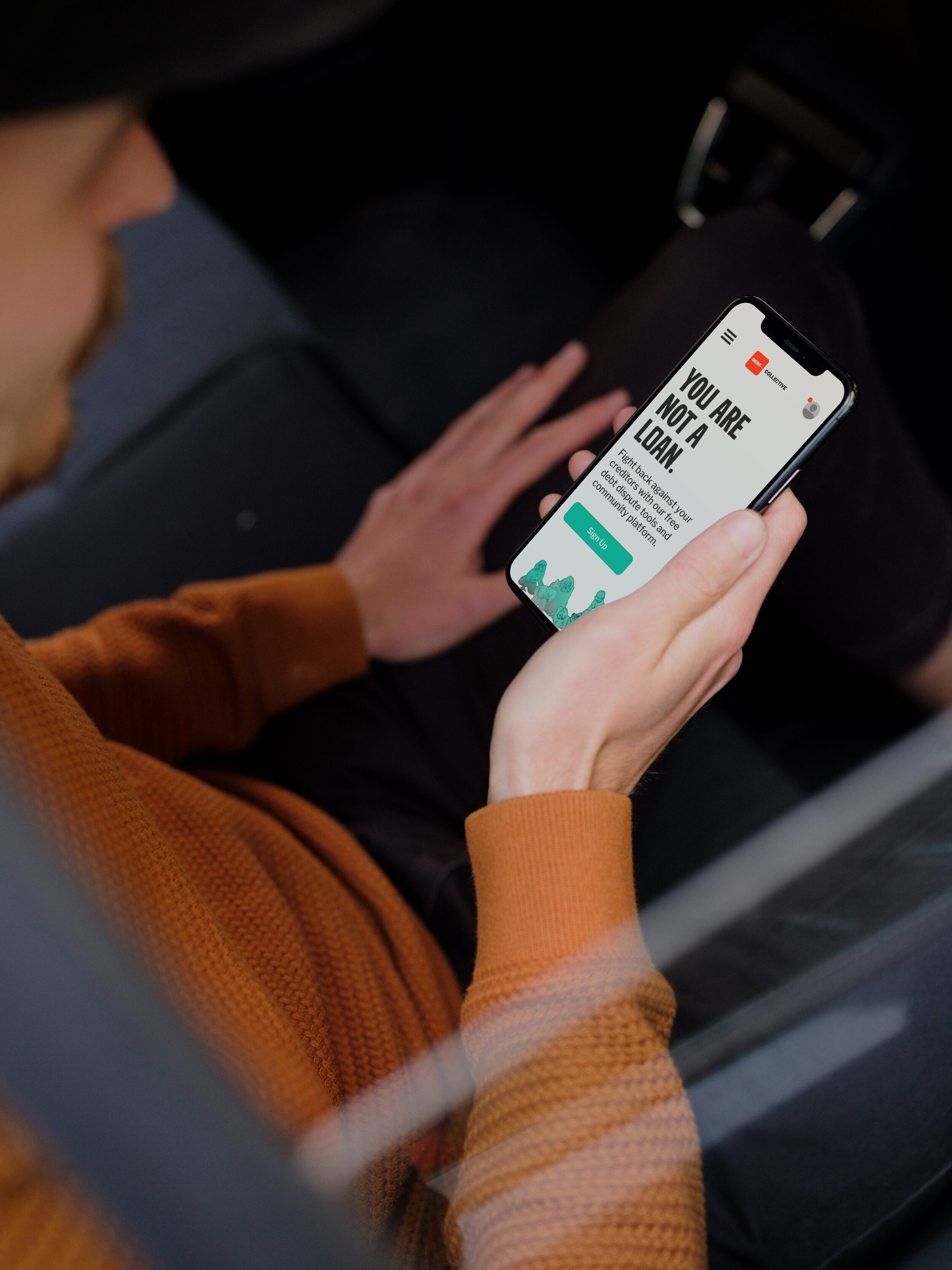
When a client sits down in the retail office there are two monitors — one facing the tax pro and one facing the client. The client monitor is known as Companion at H&R Block, and when I was looped in on discussions to overhaul the experience, it hadn’t been updated in over a decade. While the goal for the short term was to come up with an MVP version of the new design and deliver in less than 4 weeks, there was also room to explore future designs for when the stakeholder group was ready to progress. I delivered both with the goal of improving client engagement and satisfaction.
Role: UX Designer
Work: UX, Visual Design, User Research
objective
Create a clear and engaging experience for the client monitor that can be delivered quickly while leaving room for future enhancements.
solution
A series of static screens that support the tax interview with an emphasized real-time screen mirror and paced-out information delivering one bite at a time.
deliverables
MVP design specs
Future-facing design specs
Interactive, animated demo
Feedback and measurement plan

Kickoff
When I joined the Companion team, the product and technical stakeholders had just wrapped up an in-depth design sprint led by Kirk Lakebrink, a product strategist on my core team. Kirk and Lisa Miner, the product owner, brought me up to speed with requirements, context, opportunities, user research and more to help give the design a direction. I took the wealth of information (see below) they provided and began thinking of how we might solve our users’ problems with the current design.
primary user
CLIENT

Our main user for this product is the client — in this instance, Leslie. Leslie is a milennial plant-lover who has a day job and a side hustle at a small greenhouse with her friends. She’s a little overwhelmed by the tax process that always seems so convoluted and arcane, and instead of trying to do it herself this year, she’s decided to go in to an H&R Block office and get some help from an expert.
client Pain points
A lot of information at one time is difficult to process.
It’s hard to see what’s happening in the mirrored tax pro screen.
When the tax pro screen and Companion screens are showing two different things, it’s unclear which to trust — or focus on.
It’s kind of boring just to watch the tax pro enter data for a big chunk of the interview
secondary user
tax pro

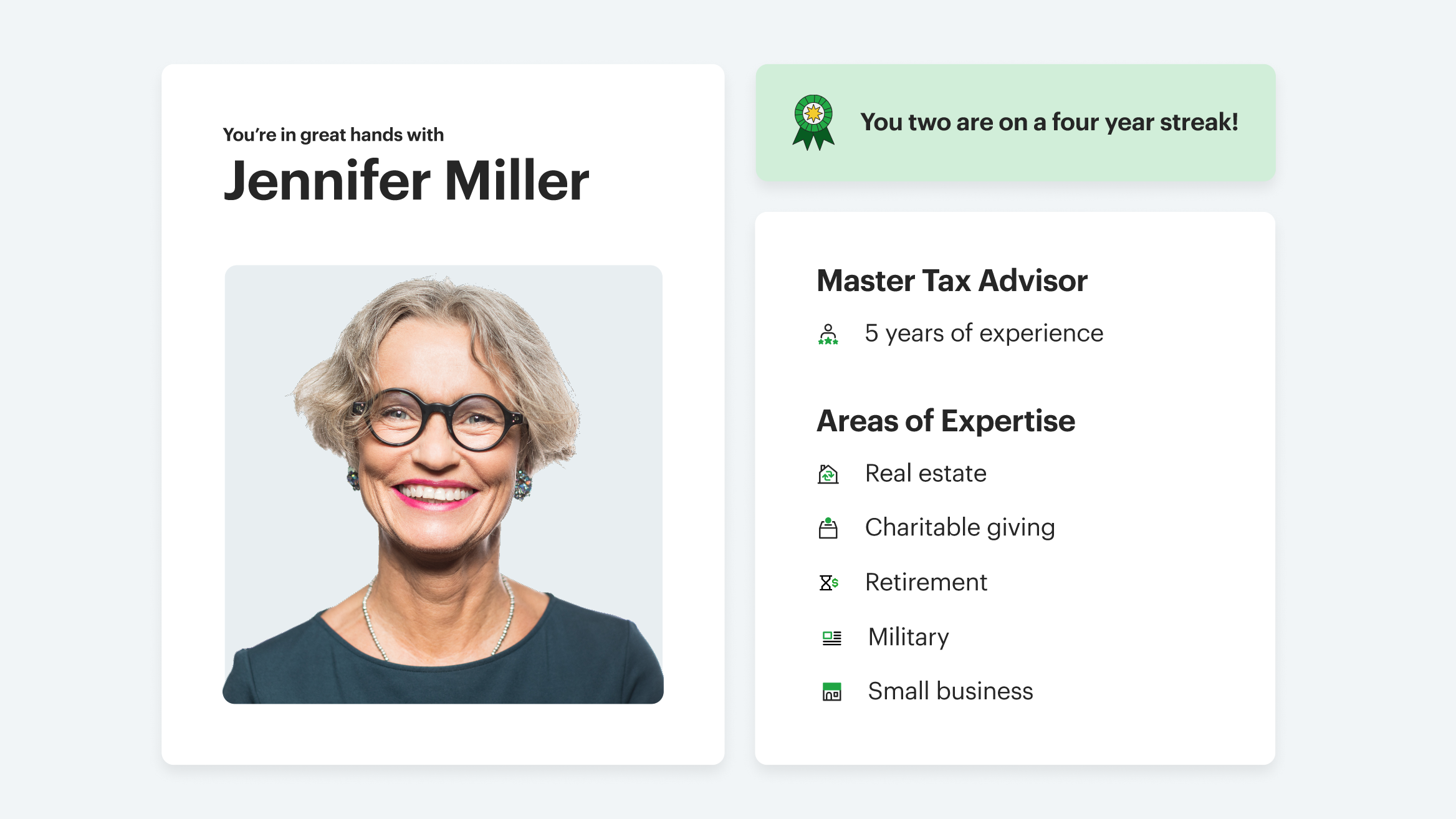
Our secondary user for this product is our tax pro, Jennifer. Jennifer has been at this for five solid years now, and she’s more than confident when it comes to the tax interview. She’s gotten a special certification for small business expertise, so she always requests that entrepreneurs be sent her way. To Jennifer, the tools at the tax desk are nice, but the real focus is on the relationship with her clients.
tax pro Pain points
The tax pro has a specific and unique flow
Have to sometimes assure client on discrepancies
Sometimes it’s easier just to show my montior
Want to avoid slowing down at all costs
Don’t like that the client can see diags — error flags which undermine credibility if the client sees them
What the client sees
The client sees two main things — a screen mirror of the tax pro’s screen, as well as the Companion frame, which includes a summary of select key information on the left and a progress indicator on the top. Because of how small the screen mirror is and the repetition of information between the frame and mirror, clients often report feeling disoriented and having a hard time making out anything on the tax pro’s screen.
What the tax pro sees
The tax pro sees an internal tax prep application called Blockworks. If you expand you can see that this includes navigation, error information called “diags,” and other granular information. It’s also worth noting that the design does not match current brand standards.
how do we solve the problems of both users with one design?
design challenges
differing perspectives
While the experience is client-facing first and the tax pro will be operating on their own separate screen, what the client sees will affect the interaction between both parties. Both perspectives deserve consideration.
transparency vs. presentation
One of the biggest pieces of feedback we found from our initial client research was that there were often questions or discomfort when what the client was seeing was not the same as what was on the tax pro’s screen, which is sometimes visible to the client. We want to give the client a purposeful, edited experience, but don’t want to create dissonance or confusion if the two screens don’t match.
difficult data mapping
While it’s possible to show data updating in a summary section, the technical partners on the project expressed concerns about the difficulty of mapping this data. Any designs leaning on that as a feature needed to take that into account and evaluate what is necessary or adding value.
urgent need for mvp
When I came on board the Companion team, there was an urgent need from the business side to bring an MVP version of Companion to the field as soon as possible. That consideration set our design effort priorities and restricted exploration time to the shorter side.
pacing & engagement
In the tax interview, there’s really not clear built-in orientation for the client as to where they are, where they’re going, etc. outside of what clues can be gathered from the client and tax pro monitors — it’s all up to the tax pro’s discretion. Likewise, while there are common steps in each interview, the actual points of conversation are up to the tax pro to deliver. Can the pacing and engagement in the experience be improved?
change aversion
While we didn’t hear this as much from clients, field, product and business stakeholders expressed concerns when a great degree of deviation was proposed. There was a ton of room for reimagining what could be possible for the product, but that same desire for innovation also created tension at times.
design GOALS
emphasize the relationship
One of the main business metrics for retail is retention, and our data suggests this is driven by the tax pro-client relationship. Wherever we can keep the focus on the conversation and the client’s specific needs, we want to do so.
convey meaning with clarity
The content we use should focus on delivering one clear message at a time, and use language that removes pretense and jargon. In addition, anytime we show clients information, we want to explain why it matters.
reinforce brand
The new design system for Block was more developed by the time we started this project, so it was clearer where the visual direction was headed when we began. That being the case, the design to support expanded functionality and overhauled apps that might appear in the screen mirror down the line and still fit within the brand identity.
improve accessibility and legibility
One of the biggest pieces of client feedback was that reading what was happening on the mirror of the tax pro’s screen was sometimes impossible, but made the client feel like they were following along. We want to make sure that every element we include has high affordance.
Empower the client
The client wants clear information, good advice they can’t get without coming into the office, and the ability to drive parts of the tax conversation. The client monitor should empower them in those ways.
empower the tax pro
Tax pros often felt that the client monitor caused insecurity and confusion and, thus, questions and conflict that bogged down the tax interview. Often tax pros felt forced into sequences or talking points that weren’t natural or apropos to the current point in the conversation. We want the Companion screen to keep the tax pro in the driver’s seat.
MVP design
Our MVP design aimed to do one thing well — show the screen mirror in clear detail to the client. With this as our priority, we were able to get something stood up quickly and could build out from there.
screen mirror
In our design, the main portion of the client’s screen is the mirror of the tax pro’s screen. We wanted to maximize the screen mirror’s real estate to make it as legible and easy to follow as possible so the client could keep up in real-time. The screen mirror just crops to the current ‘input’ screen, so unnecessary things like diags, the app sidebar, and the header from some of the tax pro’s other products aren’t visible to the client.
progress bar
As a practical reality of maximizing the screen mirror, the only area really left for other elements was on the left or right. We went with the right after some early feedback, but regardless we decided to keep the progress bar simple and unobtrusive, focusing on the four major steps of the tax interview. Other iterations had more detail, but we felt this struck the best balance of simplicity and clarity.
avatar
Since people are getting more and more used to screen sharing and remote collaboration, we decided to take a page out of products like Figma’s book and have an avatar in the top right to reinforce that the section on the left is the tax pro’s screen. While it might seem redundant to have the tax pro’s bio photo in the avatar, we felt it added clarity, especially for clients completing a virtual appointment.
An alternative design showing key information on the right with progress on top
An iteration with a three-column approach
An early design with a top right progress bar
future-facing design
For the future-facing design, we wanted to see how we could both reimagine the experience and build from the MVP design. Either way, our goal was to create a design that supported a path toward brand and visual cohesion while also creating more touchpoints for engagement between the client and tax pro, as well as setting the pace and reducing cognitive load by using transitions and review steps.
A look at the breadth of our early explorations.
The entire future-facing companion flow.
transition screens
Instead of jumping straight into the screen mirror, we wanted to pace out transitions to help orient the client and give them a preview of the steps ahead. In addition, we incorporated some light animations to reinforce the sense of progress and direct feedback. The below shows how the transitions update between sections.


tax pro intro screen
Toward the beginning of the flow, we wanted to take a moment to reinforce the tax pro’s expertise and the relationship between the client and the tax pro. Messaging on the right highlights the tax pro’s specialties and also calls out how long the pair have been working together.
The message in the top right can also be swapped out for something more relevant based on conditional information, such as calling out that the tax pro is small business certified if the client has a history of small business tax needs.
Screen mirror
This is really just the MVP section that you’ve seen before. However, if you compare the left and right screens here, you can see that the right is much more in line with the design system you’ve seen so far. Because the old screen is just reflecting the legacy application it’s mirroring, we can’t really change the look of what’s inside the mirror container. However, all of the applications that are featured in the mirror are set to be brought into the fold of the design system, so the frame can support those updates over the long haul.


Review screens
Since the new screen mirror layout removes the ‘key information’ side section that restated the tax pro’s data entry values, we decided to place a review screen at the end of each section where the client can stop and look over their information before moving on. We wanted this to be simple but have enough depth that the data was still meaningful. For example, the sidebar previously would tell you that you had a W-2 or a tax credit, but without any dollar value to give the client an idea of what kind of impact it was having on the return as a whole. In addition, we think this page could support tips or insights in the future.

user feedback
While we’re still coordinating client feedback, we were able to get some preliminary feedback from tax pros, who were able to offer insights into their own impressions as well as what they might anticipate from clients (though the latter is informed speculation). For our first phase of feedback gathering we used focus groups and surveys.
“Way easier to read”
Our user group felt that the screen mirror was much easier to read — in fact, it was “actually useable,” as one user put it. Many of the users liked that it was easier to see what was happening in real-time. “I wasn’t sure where to look before, but I prefer being able to correct what’s happening as it’s happening.”
“do we need the photo?”
When we first showed the tax pro information screen, a good chunk of the tax pros were indifferent or asked why we were showing that if they were right in front of the client. “I mean I’m right here; isn’t that a little redundant?” one asked. “I like the little profile picture on the screen share thing, though.”
“feels more relaxed”
The users enjoyed the pacing of the experience, mostly thanks to the transitions and review screens. Others noted that it was easier to control the flow and keep the focus on the conversation. “It’s nice for them to see how [we’re] working and how complex it is, and it feels like [we’re] able to take a second to get things right.”
“want more control”
One of the louder objections we got from folks in our survey group is that some tax pros didn’t want to have to stop and go through the review steps if they felt it was forced or inconvenient because they had been burned in the past. “They tried to do that already and we hated it. It slows down everything and it wasn’t even in the right parts.”
“like the review step”
One area we were worried about changing was the summary information on the sidebar. However, users seemed to enjoy the review step in its stead. One shared: “There will still probably be times when we need to go back and fix things, but taking a minute to actually stop and go over the info is big, and I think the clients will like it, too.”
“liked the new sidebar”
Most folks in the user group reacted positively to the simplified progress bar, including the avatar indicating that the tax pro’s screen is what’s being mirrored. “I like that everything’s out of the way. It’s easier to know what to pay attention to.”
the future of companion
While we’ve begun work on the MVP version of the project, we’re currently working on doing some user shadowing and focus groups with some office and virtual clients to continue our user research. I’ll continue to update this page as we push the design into the future.
teammates
Jamie finkelstein
UX Designer
bree walter
UX Designer
lisa miner
Product Owner
tyler yoder
Project Manager