
H&R Block
return wrap up redesign
After nearly two decades with the same design, Block saw an opportunity to bring the last leg of the tax interview, the Return Wrap Up, into the modern age in order to match its updated brand standards and bring delight to both the tax pros and their clients.
Role: UX Designer
Work: UX, Visual Design, Prototyping, Workshop Facilitation, User Research
objective
Reimagine a previously hyper-linear experience with outdated design and bloated content into a clean, modern application with intuitive navigation, simplified cognitive load and seamless technical integration with a dozen partner teams.
solution
An end-to-end application that provides a simple, intuitive and modern experience for tax pros and their clients alike, aligning with the rest of the office applications ecosystem.
deliverables
Post-MVP workshop
Post-MVP full-feature design specs
End-to-end interactive prototypes
Pilot feedback and measurement plan
Regular tax pro user feedback


KICKOFF
I joined the team a few months after an initial MVP design sprint was completed in August of 2019. I worked with the previous design lead, Bree Walter, to take over the project and lead the Post-MVP design effort.
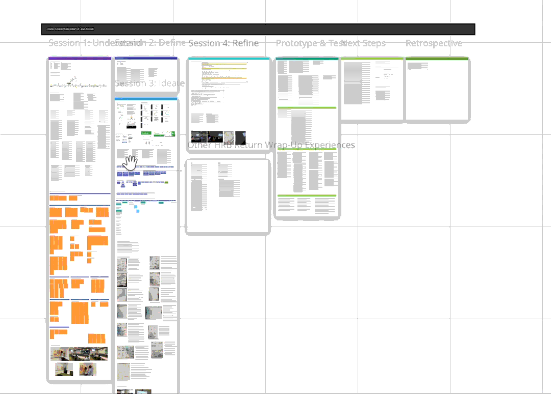
The August workshop’s findings provided a huge wealth of background information, especially from the Understand and Define sessions, which I quickly ingested to deliver and test an end-to-end, interactive prototype. Shortly into 2020, I facilitated a post-MVP workshop aimed at defining and refining our end to end experience so that we could hit our release target of January of 2021. Our sessions with stakeholders followed this outline:
Understanding the problem
Defining goals and design drivers
Ideating potential solutions and design iterations
Refining the designs into a testable prototype
Test the prototype and get actionable feedback
As you can see, there was plenty of information to work from.

identifying our user:
the tax pro
As we kicked off the project, we did a deep dive into our user base, conducting informal interviews and gathering demographic data. Based on internal research, most tax pros are older women who would rather focus on the relationship with the client than navigate applications. Some interesting figures:
66% of tax pros identify as female
70% of tax pros are 50 or older
41% of tax pros have less than 3 years of experience
Retention for first year tax pros is only 57%
"My clients are like my family.”
PAIN POINTS
selling vs service
Tax pros want to put their energy into the relationship with their clients, but awkward product upsell moments are woven throughout the Return Wrap Up.
navigation
When we started, navigating through the Return Wrap Up was a hyperlinear “next” and “back” experience, only showing one section at a time without any ability to skip around for ad hoc changes.
client fatigue
By the time the tax pro reaches the Return Wrap Up, the client has been in the tax prep interview for quite a while and the end portion can feel like a slog.
too much content
The amount of reading required in the legacy product was staggering — tax pros, especially first year tax pros, need content that empowers them rather than burdens them a la cognitive load.
steep learning curve
The legacy tool fostered tribal knowledge that made it difficult to onboard and retain new tax pros. Tax pros reported being unsure of where to go for technical help.
not all tax pros are alike
Although the majority of tax pros are over 50, tax pros come in all ages and experience levels. Older tax pros expect simplicity and ease of use, and younger tax pros expect clean, modern design practices.
An example of a legacy screen. See how those pain points might arise from this design?
tax pros need something simple and empowering. how do we get there?
design challenges
scope
This project was probably my biggest undertaking to date. The scope of the design was massive — over a dozen major feature sections, each with its own branching flow. The release was set for a year from when the project gained funding, meaning many sprints adding up to a marathon design and development cycle.
partner integrations
The product is essentially a large experience comprised of many features (think financial services, products, pricing tools, appointment managers, etc.) seamlessly plugging in at each step of the flow, sometimes even overlapping. Not only did this translate to business logic complexities, but also to a large pool of stakeholder partners that each had their own requirements coming into the process. Getting over a dozen product owners on the same page under one banner meant we had to hash things out at the vision and strategic levels early on and maintain communication throughout.
Low tech user
Our primary user, the tax pro, represents a more mature, less tech-savvy person more oriented to the relationship side of the job. In order to improve their experience, we needed to create a simple design with high affordance that got out of the way of the tax pro and let their expertise shine.
NASCENT DESIGN SYSTEM
As an early adopter project for the (at the time) new Block Design System, the product was selected as a candidate to incorporate the company’s new brand standards and UI kit as it was being expanded to include more atomic and composite elements and assets like illustrations. While the design system team did a stellar job of governance and ingesting our needs as they arose, we also had to move forward to fill gaps with our best judgment to meet our roadmap deadlines and avoid churn.
high complexity
The tax industry is one of the more complicated fields out there, but it’s Block’s job to position the tax pro as an expert and make the client’s filing experience feel like a breeze. Distilling a high volume of financial information into a simple and untimidating experience would take some finesse.
rigid product dependencies
Some financial products and services were placed in clunky sequences in the legacy product because of certain business logic requirements. Meaning, the flow we needed to create would have many branching paths depending on what products or financial services a client selects. Some states are only visible when a certain product or service is selected, for example, but other products couldn’t come before others or vice versa, putting some rails on the flows we could potentially design. In other places, text-heavy legal hard stops requiring signatures were scattered throughout the experience, causing breaks in the pace of the experience.

One of many feature-level definition sessions — with a view!
design GOALS
empower tax pros
The key phrase behind this redesign. Tax pros should feel like they are confident and in control of the tool in front of them, not the other way around, so they can focus what matters — their relationship with the client.
modernize & simplify
The product should match Block’s brand standards and use modern design practices. Content should be just what the tax pro needs at a given time, not be bogged down with extraneous or legal information that can be provided on a contextual basis.
remove pressure
Instead of locking clients into one marketing screen after another, the product should give tax pros talking points when they need them, but instead give them the flexibility to talk about products and services in a casual and transparent manner.
improve efficiency
Tax pros should be able to navigate back and forth throughout the experience quickly and easily, and should be able to finish out the tax interview without it becoming a slog in the home stretch.
end on a high note
Being the last thing the client will experience, the product should help the tax pro deliver delight and confidence to their clients and make a lasting impression. The product should leave all parties with a sense of completion and clear idea of next steps.
satisfy & retain
This applies to both the tax pro and the client. Newer tax pros should have an easier time onboarding and gaining confidence with the tool, and clients should benefit from being absorbed into the broader Block product ecosystem, enabling tax pros to support the relationship year-round.
from concept to prototype

concepting process
After defining our design drivers and gathering requirements from product stakeholders, I defined our flows in a charting tool. Next, I took our workshop sketches and started exploring potential solutions for each feature in UXPin.
interactive prototype
From there, I refined the designs with our stakeholder groups. Once we had settled on some of the ideations as firm directions, I created an interactive “happy path” prototype that we could test with actual tax pros.

USER
testing
Once we had our prototype in hand, we performed moderated testing in person and virtually with tax pros from a variety of demographic backgrounds and experience levels, recording the sessions, gathering qualitative and quantitative data along the way, and interviewing the tax pros at the end of their experience.
user feedback
“It’s so much faster”
Tax pros felt that the prototype experience was faster and easier to navigate via scrolling and navigation menu. Compared to the linear progression in the legacy product, this was a big hit. One tax pro put it in perspective: “It seems like a little thing not to have to click next, but when you’re doing that on 200+ returns, it starts to add up.”
“This looks too much like diy”
An objection we got from a small group of tax pros was that the modern design system may detract from the perceived expertise of the tax pros by looking too similar to the do-it-yourself online solution Block offers. “Why come into the office? They’re going to see this and think, ‘oh, I could just do that at home.’”
“It looks so clean”
The new design system was described as feeling fresh and intuitive. Most of our sample group expressed that they would be “proud to use this” product in the office versus the dated look of the legacy application. “It’s brighter and more modern; it’ll be a really noticeable difference [for our clients],” one user added.”
“not sure when to continue”
A few folks in our sample group noted that sometimes it was unclear when it was time to advance or take action. While the button designs have changed since, some users remarked that the buttons were not clearly reading as ‘actionable,’ and coming from an expectation of clicking a ‘next’ button, the action to advance to the next section was not clear to some users. “It would be nice if it were easier to see what you can click on,” one user said.
“legal stuff was way easier”
Users in our sample group saw our consolidation of all legal signature moments into one experience as a huge win. One summed it up: “This is something that I really enjoy. Today it’s disjointed in the flow to have the signatures come up. Instead, you can just get the legal stuff out of the way and get to what matters.”
“don’t like the ending”
Tax pros previously ended the experience by scheduling next year’s appointment, but in our prototype sequence, we made 'completing the return’ the final action in the process. About 60% of our tax pro sample said they preferred the appointment scheduling moment as the last conversation with the client It’s another conversation that we can have as a preparation moment for next year and I don’t know if I would be as comfortable with this since we haven’t squared everything away.”
results


teammates
bree walter
UX Designer
kriti kafle
Business Analyst
lisa miner
Product Owner
Jason cross
Business Analyst
