the debt collective
landing page
The Debt Collective helps folks in debt (read: most people) dispute predatory loans and attain financial dignity. It started with a debt strike in 2015 at Corinthian College and snowballed to thousands of members from there, gaining the endorsements of notable legislators like Elizabeth Warren, Dick Durbin, and more. I partnered with the Collective to improve conversion on their landing page, aiming to bump member sign-ups and donations. Eventually, there was a need for other things like a donation page, explainer videos, UX writing throughout the site, and illustrations for use on the web and in print.
Role: Web & Motion Designer
Work: Web Design, Motion Design, UX Writing, and Illustration
the ask
Increase sign-ups, donations, and subscriptions via landing and donation page redesign and content strategy while sticking to the established design system.
solution
Simplified and straightforward pages with clear and easy CTAs, little to no jargon, and an emphasis on how the user’s action makes an impact.
deliverables
Landing page design specs
Donation page design specs
Analytics plan and insights
Explainer motion videos and voiceover
Web and print illustrations
starting point
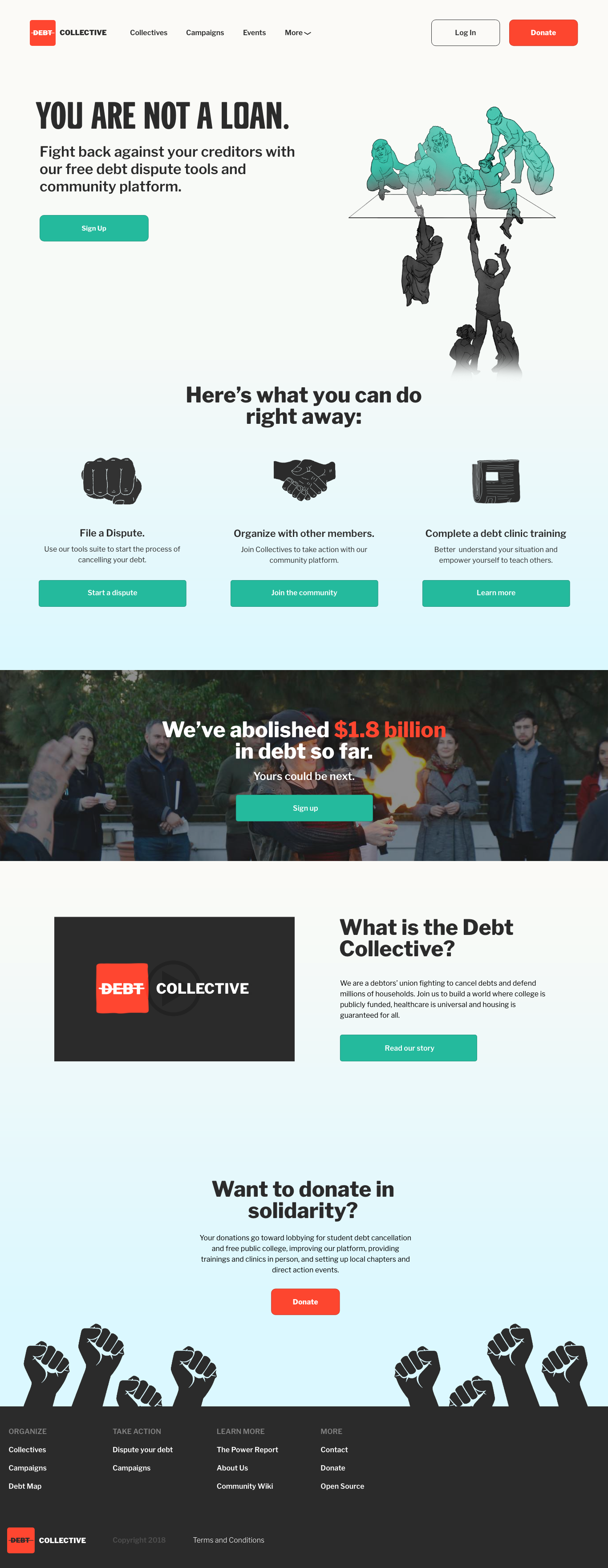
When we first partnered to work on updating the look and feel of the site to match a newly established design system, the site looked fairly stark, urgent, and even aggressive. It’s easy to see off the bat that several of the links and key buttons like Sign Up and Log In were not functional or visible (I’d later learn this was because of a halt in development). There are also quite a few messages being delivered here in the hierarchy, and while the taglines are punchy, it’s not super clear what the Debt Collective is or does. I should also note that while there is a link in the footer, a donation page did not exist at the start of work.
The original landing page. If I recall correctly, these weird yellow boxes (probably for dev testing?) didn’t get removed ‘til the launch of the new page.
user research
who doesn’t have debt?
At first glance, it’s pretty obvious that the vast majority of us have debt, and it affects us materially and psychologically. My first thought was to really drill down on the content and messaging of the landing page and explain why the Collective’s services actually matter to the user in terms of their personal debt.
Without access to analytics or demographic data on the member base, I got scrappy and asked friends and family with debt what they thought of the site and if they understood what it was about and why it might be useful to them. I also scoured the community platform for accounts of how the platform has helped or could be improved.

user feedback
“What is this?” Unclear on what the org does
“Where do I click/what do I do?” Unsure of what is actionable
"What do I get?” Unsure of member benefits
“But what do I do after?” Unsure of what joining entails
“I can’t just not pay my loans…” Measures seem extreme or unrealistic to average person on further explanation
members’ feelings on debt
“I have my back up against a wall.”
“Sallie Mae sent my debt to collections even though I have a qualifying disability. I don’t have any way to repay this and my credit is being destroyed.”
"My private loans are still forcing me to pay during the pandemic.”
“I didn’t really know what I was getting into.”
“I’ve been at the point where I can’t pay anything more than the minimum, but that’s not even outpacing interest.”
debt by the numbers
The average American has about $50k to 90k in debt, depending on your source
32% of American workers have medical debt, with an average of $2.2k in collections
While age 40-49 had the highest average debt per citizen at $78k, ages 30-59 had an average debt of $69k, with no group average below $60k
Predatory payday and student loans account for $25b annually
debt and mental health stats
53% of high student loan borrowers have experienced depression.
Nine in ten borrows report experiencing “significant” anxiety about their debt.
One in fifteen student loan borrowers report having considered suicide because of their debt.
A Nerdwallet study found 56 million adults are currently “struggling” to pay medical bills, the leading cause of bankruptcy in the US
A majority of student loan holders report not “fully understanding” what they were getting into when they applied for loans.
how do we get more users accessing the debt relief tools and info they need without adding more stress?
design goals
clear value prop
Explain in direct and material terms why joining or donating to the organization is helpful and valuable to the user.
clear call to action
Make it obvious how to proceed and what the user can expect after clicking a CTA.
simple language
Meet people where they are — don’t use politically radical or financially arcane language in the content but speak plainly.
inviting look and feel
Move away from the urgent and stark visual aesthetic to a softer one of welcoming and solidarity.
say what the org does
Explain what the Collective is and does, assuming the user knows nothing about advocacy, debt/credit, or policy.
provide solidarity
Provide info and language that shows users that they aren’t alone in their debt journey and assuage any negative mental stigma.
content
The first thing I did was take inventory of the content we had and the content we would need on the landing page. If we were going to educate people on the organization and get people to sign up and engage with the community platform, we needed to make our content as clear and simple to understand as possible — especially because debt is such a stressful and arcane subject.
To start, I talked with my client partners about what information they would like to see on the site, and, more importantly, what they felt were the crucial pieces of information and actions they wanted the user to be able to take from the landing page. The organization had a lot of great stats on how they have a proven ability to provide debt relief, but we really had to whittle down to what the user was getting out of joining or donating and how they could receive that benefit.
I wrote down the actions and information we identified on bite-sized sticky notes in Keynote via a remote call, then ranked them from highest to lowest priority with the client team. While the desired actions were easy enough, we had a lot of information that the client felt was necessary to include, so I broke that information into must-have and nice-to-have columns and had them sort and rank again.

concepting
Once we had the content outlined, I started working on design concepts in Adobe XD and later Figma that incorporated our priorities and messaging.

final landing page
After some discussion and review with those same friends and a few members on the platform, this is where we ended up.