
SS&C Technologies
digital investor dashboard
The Digital Investor financial dashboard hadn’t seen a design update in over a decade, long before a UX team even existed at SS&C. When I came on board, the team was looking to build something from the ground up with modern design practices and a major focus on accessibility, There was just one caveat — the product still needed to be white label, meaning the design would need to support branding and restyling (within reason) from SS&C clients.
Role: UX Designer
Work: UX, visual design, design system creation and governance
objective
Design a white label investment dashboard focusing on modern design and accessibility, client brand support, and efficiency via a product-wide design system.
solution
A sleek, easy-to-use (and update) dashboard web app that looks and feels like belongs in the client’s product ecosystem.
deliverables
Dashboard design specs
Interactive happy path prototype
Design system and documentation
Client brand customization toolkit
Client brand ingestion micro app design specs

Kickoff
Essentially starting over from zero, my partners in product and dev and I came together to discuss the overall vision for the new dashboard, looking at how we might create something that really provided a modern, customizable product without compromising the user’s experience. We first mapped out all of the functionality and characteristics we wanted to capture in the application.
I broke out key functionality, pieces that will need to support customization, and other requirements from the product and business stakeholders (for example, the legacy product was not ADA compliant, and thus we needed to address this from a legal standpoint in the new product). It may sound a little quaint to put ‘responsiveness’ so high, but the previous product was not accessible via mobile at all!
We also looked at what order we’d tackle each of these pieces from a prioritization standpoint to give everyone an idea of where to focus our efforts and what to stand up first.
comparative analysis
Without a dedicated researcher and after getting blocked on the user analytics front, I decided to conduct some research of my own about what else was out there in the industry. From a design perspective, I looked for patterns and systems that would support our requirements, and from a strategic perspective, I sought out competitor products to help give us an idea of what other folks were doing well and where they were struggling, as well as to help carve out a niche for the product.
desktop inspiration
mobile inspiration


Common Patterns
left-hand nav
Almost all of our comparative design specimens had a left hand navigation on desktop. Sometimes it would fly out when hovered or clicked and just use icons to show that you could quickly change modes. We felt this would be a good way to show as much important information as possible on the right hand while still making it easy to navigate from context to context.

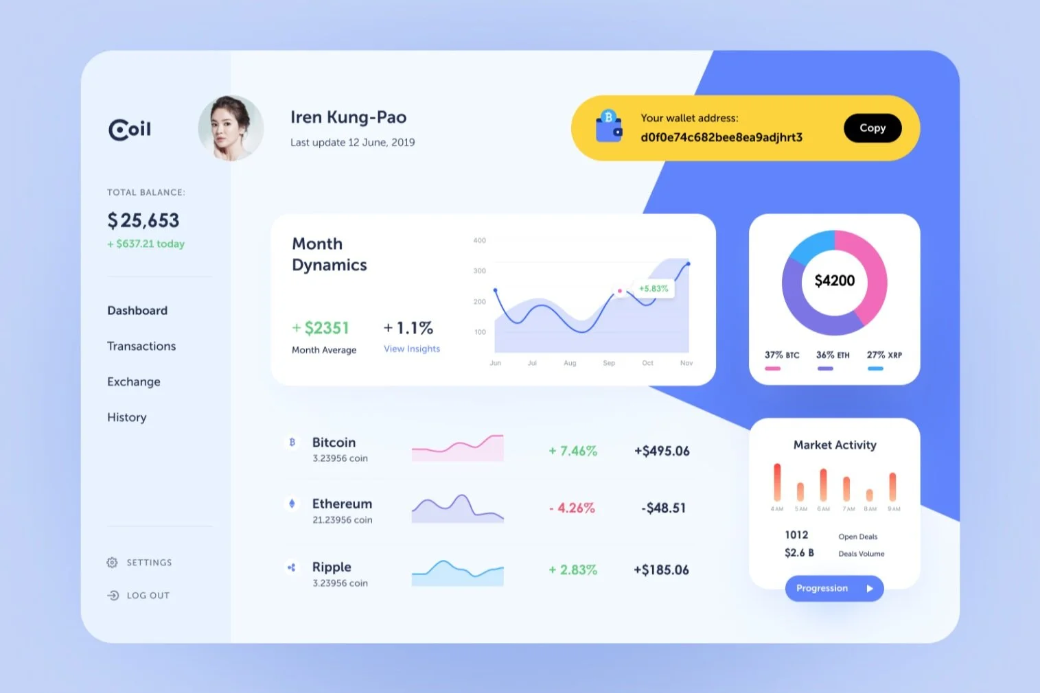
CARDS & COLUMNS
Whether on desktop or mobile, the apps we referenced made use of cards and columns to break up information into bite-sized chunks, create hierarchy and relationships and help emphasize what is actionable and what is informational. Since we had lots of accounts, transactions, and performance metrics to track, cards made sense to help break things out and create an easy to follow information architecture.
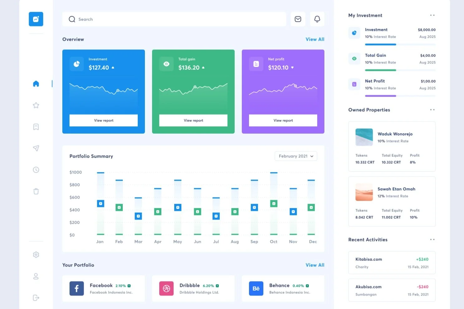
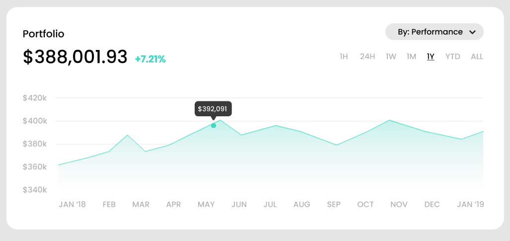
DATA visualization
While we got a lot of arguments from the business side that data visualization like graphs and charts were ‘nice-to-haves’ or ‘frilly,’ most of the applications we checked out did make use of these features. I think you could argue that this type of content is pushed by designers because of the visual component, but I thought the throughline was actually that it condenses information into an easy-to-digest format.
Simplified info > Granular info
Some partners insisted early on that users wanted to see as much information as possible, down to the names and numbers of transactions (which essentially amounted to transaction IDs) — but no one asked the users about this, or at least there was no data to support this. What we found in the great majority of the apps in our comparative survey was that hierarchy came first — show things simple and in summary first, and then let the user drill down if they choose.

how do we provide users with the info that matters at a glance?
designing for functionality
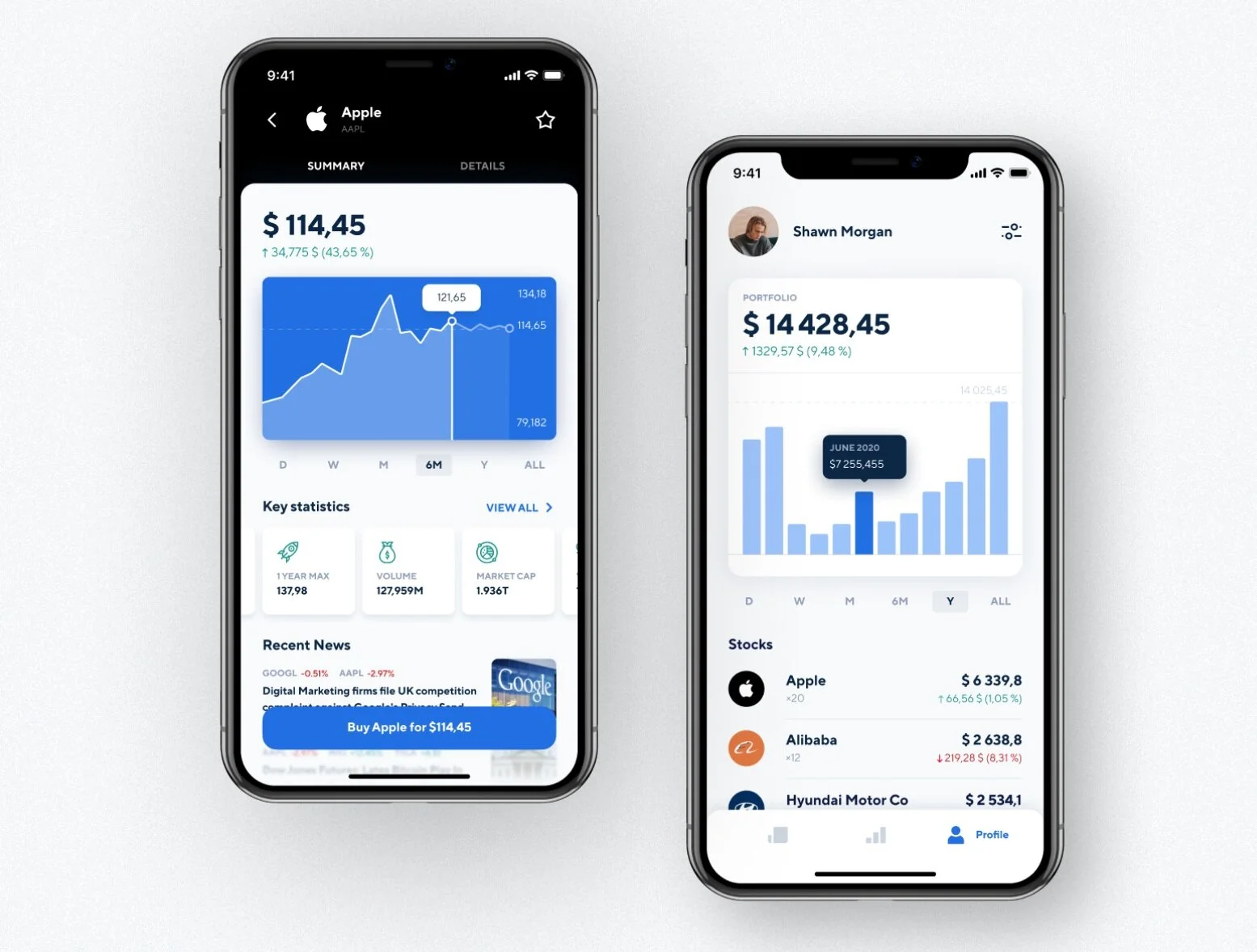
portfolio DESKTOP layout
After some pen and paper sketching, the first thing I did in Figma was wire out the areas of the page in accordance with our preferences from the comparative analysis and our prioritized functionality from kickoff. Since over 78% of our users used the legacy product via desktop, I started there. I increased fidelity as I went, starting with containers, then column and card hierarchy, and finally ending up with a lo-fi mockup. I wanted to keep the portfolio total as the most important piece while still showing “neutral” components to support brand restyling later on.


Performance
A big opportunity to provide some value to the user was in how we visualized performance. Not only would we be able to show numerical values, but we could also show how their portfolio had performed with data visualizations like line graphs and other charts. We explored a few variations of this approach for the whole portfolio and the individual accounts (though the explorations for individual accounts were parked in the backlog before my departure from the team).


ADAPTING FOR MOBILE
Once those main items were laid out, I adapted them to mobile — rather than showing all of the explorations, I’ll just show you the farthest fidelity before I actually got to prototyping.

recent activity
After working through our layout so far, we pretty much had one logical place to set in recent transactions — the secondary section on the right. We added in several transactions at first, but had to reduce this as other elements came into play.


secure messaging & notifications
Since there was another team in the department that had just wrapped up work on the backend of secure messaging, we decided to work together to incorporate that functionality into the dashboard. We decided to show a preview of the first message, but show the number of unread notifications as well. We also opted to put a small icon in the top right that would indicate if there were any new messages that would persist throughout any page on the dashboard.


SIDE NAV
We had pretty much mapped out what items we wanted to exist in the left hand nav, but we finalized some of the spacing and icons and added a log out option. We also tried to use the iconography to create a relationship between the left hand and the section title, where we replaced “portfolio” with “dashboard” at the top.


PROFILE / LAST LOGIN
One of our last touches was the profile and last login pieces, which we had previously wireframed out but had yet to finalize. We added in an avatar photo and the last login time, which, beyond adding peace of mind, was a legal requirement we needed to meet for this product. The profile icon could be hovered to see a profile menu with things like account settings, linked banks, contact preferences, etc. For instances without a profile picture (uploaded in the onboarding process), we decided to just show an image using the user’s initials on a grey background.

FILLING OUT THE MOBILE DETAILS
The last few touches we did also needed an adaptation for mobile. We decided to use the upper corners to place our navigation and profile menus as well as the notification inbox icon, and then stack the other elements like recent activity and notifications below, with the exception of notifications coming earlier in the flow than normal on mobile so that it doesn’t get missed. We got rid of the logo completely for real estate, and because once you were in the experience, it was a little redundant and didn’t have any additional functionality the navigation menu couldn’t accomplish. Last, we decided to make the header sticky and fixed at the top since the mobile experience would rely more on scrolling.


design system
I created a style guide using Frontify to showcase how we would handle brand customization and styling for clients, including logos, color, typography, and more.
customization SIDE-by-SIDE
You can see how much this can change the design — this was a huge selling point for our clients that still retained the value of the design and allowed us to scale after doing the bulk of the work once.


branding WIZARD
To help clients onboard to the dashboard, I designed a branding wizard to help set up the brand styling and customization — with some guard rails built-in.


